
Malgré l'importance des cartes de visite, beaucoup commettent des erreurs de conception évitables qui nuisent à leur efficacité. Identifier ces erreurs courantes vous aidera à créer une carte qui se démarque et laisse une impression durable.
Erreurs courantes dans la conception de cartes de visite
1. Informations sur la surcharge de votre carte
Il peut être tentant de surcharger une carte de visite d'informations. Cependant, la remplir de détails superflus, comme plusieurs numéros de téléphone, adresses e-mail et comptes sur les réseaux sociaux, la rend illisible et difficile à lire. Privilégiez la concision et concentrez-vous sur l'essentiel.
2. Choix de polices et de couleurs inappropriées
Les polices et les couleurs de votre carte de visite doivent être lisibles et cohérentes avec l'identité visuelle de votre marque. Évitez les polices complexes ou décoratives qui rendent la lecture difficile.
De même, choisissez des couleurs qui se complètent et reflètent la personnalité de votre marque.
3. Négliger le verso de votre carte
De nombreuses cartes de visite n'utilisent que le recto, laissant le verso vierge. Or, c'est une occasion manquée de transmettre des informations supplémentaires ou de renforcer votre image de marque.
Utilisez le verso de la carte pour ajouter un slogan percutant, présenter vos services ou même inclure un code QR pour un accès facile à votre site web.
De plus, pensez à utiliser le verso de votre carte de visite pour y afficher des témoignages de clients satisfaits. Cela renforce la crédibilité de votre marque et apporte aux clients potentiels une preuve sociale de votre expertise et de la qualité de vos services.
Une autre façon créative d'optimiser le verso de votre carte de visite consiste à y intégrer un mini portfolio.
Incluez une sélection de vos meilleurs travaux ou projets qui mettent en valeur vos compétences et vos aptitudes. Cette présentation visuelle peut marquer les esprits de vos clients potentiels et rendre votre carte de visite plus mémorable.
Éléments essentiels d'une carte de visite efficace
Lors de la conception de votre carte de visite, l'intégration d'éléments essentiels contribuera à maximiser son impact et son efficacité. Ces éléments garantissent que votre carte transmet les informations nécessaires tout en restant visuellement attrayante.
1. Intégrer les informations de contact correctes
Votre carte de visite doit comporter vos coordonnées les plus pertinentes et à jour. Indiquez votre nom complet, votre fonction, votre numéro de téléphone, votre adresse courriel et votre site web. Il est important d'offrir plusieurs moyens de vous contacter afin que vos interlocuteurs puissent choisir celui qui leur convient le mieux.
Pensez également à ajouter un code QR à votre carte de visite. Cet ajout innovant permet à vos destinataires de scanner rapidement le code avec leur smartphone et d'accéder instantanément à vos coordonnées ou à votre site web. En intégrant cette technologie, vous démontrez votre volonté d'innover et facilitez la prise de contact avec vos clients et partenaires potentiels.
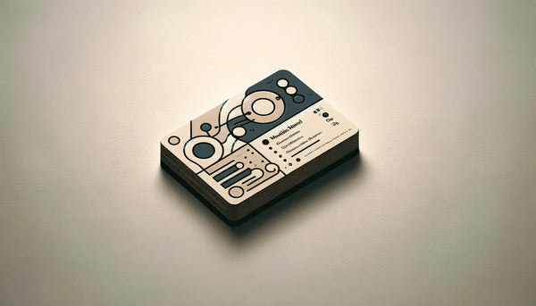
2. Choisir un design qui corresponde à votre marque
Le design de votre carte de visite doit être cohérent avec l'identité visuelle de votre marque. Utilisez les couleurs, le logo et la typographie de votre marque pour créer un design harmonieux et mémorable. Une carte bien conçue renforcera l'image de votre marque et aidera vos clients et partenaires potentiels à se souvenir de vous.
Osez sortir des sentiers battus et explorez des designs découpés originaux. Par exemple, si vous êtes fleuriste, vous pourriez avoir une carte de visite en forme de fleur.
Cette approche créative attire non seulement l'attention, mais renforce également l'image de votre entreprise, laissant une impression durable sur les destinataires.
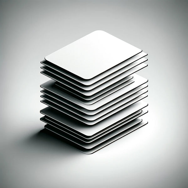
3. Utiliser des matériaux de haute qualité pour votre carte
La qualité des matériaux utilisés pour votre carte de visite en dit long sur votre marque. Choisissez un papier cartonné de haute qualité, à la fois épais et résistant.
De plus, pensez à ajouter des finitions telles que le mat ou le brillant pour améliorer l'expérience tactile et donner à votre carte un aspect professionnel.
Une autre option à envisager est l'utilisation de matériaux écologiques pour vos cartes de visite. En privilégiant le papier recyclé ou les matériaux durables, vous témoignez de votre engagement en faveur de l'environnement, ce qui peut être un atout pour vos clients ou partenaires soucieux de l'écologie.
En intégrant ces éléments supplémentaires à la conception de votre carte de visite, vous pouvez créer une représentation mémorable et percutante de votre marque. N'oubliez pas que votre carte de visite est souvent la première impression que l'on se fait de votre entreprise ; soignez-la donc !
Conseils pour éviter les erreurs de conception de cartes de visite
Maintenant que vous comprenez l'importance des cartes de visite et les éléments essentiels à y inclure, voici quelques conseils supplémentaires pour vous aider à créer une carte de visite très efficace et visuellement attrayante.
1. Un design simple et épuré
Un design surchargé peut être perturbant et nuire à la clarté du message. Privilégiez un design simple et épuré pour une lecture et une compréhension visuelle aisées. Utilisez judicieusement les espaces blancs pour mettre en valeur les informations clés et rendre votre carte agréable à regarder.
2. Privilégier la lisibilité aux polices fantaisistes
Même s'il peut être tentant d'utiliser des polices fantaisistes ou sophistiquées, la lisibilité doit toujours être votre priorité absolue. Choisissez des polices claires et faciles à lire, surtout en petite taille. N'oubliez pas que votre carte de visite sert de référence rapide ; assurez-vous donc que le destinataire puisse facilement trouver et comprendre vos coordonnées.
3. Recourir à des services de conception professionnels

Si vous n'avez pas de compétences en design ou si vous souhaitez une carte de visite vraiment exceptionnelle, envisagez de faire appel à un graphiste professionnel. Il saura créer un design unique et percutant, parfaitement en accord avec votre image de marque. Collaborer avec un graphiste vous garantit un résultat final soigné et professionnel qui impressionnera tous ceux qui recevront votre carte.
Concevoir une carte de visite qui représente efficacement votre marque et vous aide à nouer des relations durables est une tâche importante.
En comprenant l'importance des cartes de visite, en évitant les erreurs de conception courantes, en intégrant les éléments essentiels et en suivant ces conseils supplémentaires, vous serez en bonne voie de créer une carte de visite impressionnante qui se démarquera dans toutes les situations de réseautage.
Lorsqu'il s'agit de concevoir votre carte de visite, il est important de prendre en compte la psychologie des couleurs.
Les différentes couleurs suscitent différentes émotions et peuvent influencer la perception de votre marque. Par exemple, le bleu est souvent associé à la confiance et à la fiabilité, ce qui en fait un choix populaire pour les cartes de visite dans des secteurs comme la finance et la technologie.
En revanche, le rouge peut exprimer l'énergie et la passion, ce qui peut convenir aux entreprises des secteurs créatifs ou du divertissement. En choisissant soigneusement les couleurs de votre carte de visite, vous pouvez créer un lien subtil avec votre public cible et laisser une impression durable.
Outre la couleur, le choix du papier peut également avoir un impact significatif sur l'aspect général de votre carte de visite.
Choisir un papier épais et de qualité supérieure confère une impression de professionnalisme et de durabilité. Cela permet également à votre carte de se démarquer parmi les nombreuses cartes de visite génériques et fragiles. N'hésitez pas à expérimenter différentes finitions de papier, comme le mat ou le brillant, pour sublimer l'aspect visuel de votre carte.
Comprendre l'importance des cartes de visite
Les cartes de visite jouent un rôle crucial dans le réseautage professionnel . Malgré les progrès technologiques, l'échange physique de cartes de visite demeure un moyen concret et personnel d'entrer en contact avec autrui. Il permet d'établir un lien direct et de laisser une impression durable.
De plus, les cartes de visite sont le reflet de votre identité de marque . Elles ne se limitent pas à un simple morceau de papier contenant vos coordonnées, mais témoignent de votre professionnalisme, de votre style et de votre souci du détail.
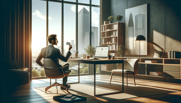
Le rôle des cartes de visite dans le réseautage professionnel
Lors de conférences, de salons professionnels ou de tout autre événement d'affaires , les cartes de visite constituent un outil précieux pour échanger efficacement des informations. Elles permettent aux clients, partenaires ou employeurs potentiels de vous contacter facilement après l'événement. Une carte de visite soignée augmente vos chances de transformer ces contacts en relations fructueuses.
Comment les cartes de visite reflètent votre identité de marque
Votre carte de visite est l'occasion idéale de mettre en valeur la personnalité de votre marque. Le design, la typographie et les couleurs doivent être cohérents avec l'identité visuelle de votre entreprise. Une carte bien conçue véhicule une image professionnelle et harmonieuse, laissant une impression positive et mémorable.
De plus, le matériau et la texture de votre carte de visite contribuent à l'impression générale qu'elle laisse. Par exemple, opter pour un papier cartonné de haute qualité à la finition lisse peut véhiculer une image de luxe et de souci du détail.
En revanche, choisir un papier cartonné texturé peut ajouter une expérience tactile unique, permettant à votre carte de se démarquer des autres.
De plus, la mise en page et l'organisation des informations sur votre carte de visite peuvent faire toute la différence. Pensez à inclure non seulement vos coordonnées, mais aussi un slogan ou une accroche concise qui résume l'essence de votre marque. Cela aidera vos contacts potentiels à se souvenir de votre entreprise et de ce qui la distingue de la concurrence.


